SHARE
How a Great E-newsletter Broke the Sales Process
March 20, 2014 | 4 minute read

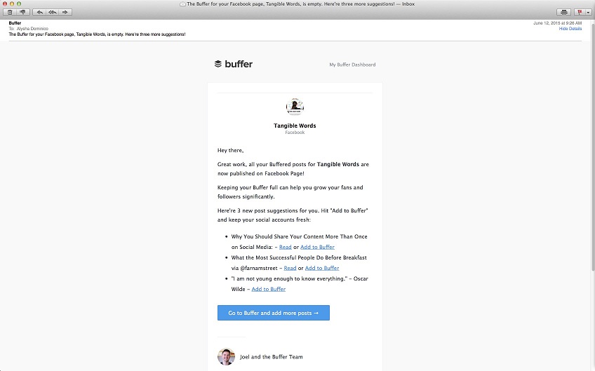
I just received an e-newsletter with a headline that startled me so much, I had to open it. I got an email from Twitter Counter saying “53 people unfollowed you on Twitter”. I thought, “What the hell did I post about to deserve that?!” And had to open it even though I was in the middle of something else.
It turns out, it was just my regular Twitter Counter digest telling me the followers I gained, but they had an article showcasing a new feature that tells you how to track Unfollowers, a feature not previously available.
I was intrigued and took the required action - I clicked on their link to read more, with the intention of doing what they told me to do: turn on this new feature before I forgot about it. They used the “ Offer, Incentive, Action” formula I’m always talking about in our content marketing workshops perfectly.
Their e-newsletter did what it set out to do: it got me to open the letter, read it, engage and then take action. Excellent work.
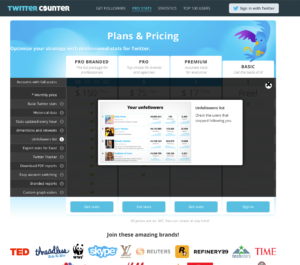
However, that’s unfortunately where the excellence stopped. The page the link took me to confused me! The email said, “activate the free Unfollowers feature”. So I thought this was a new feature in my account. Instead I was taken to a link showing all the types of paid accounts. The action I took was so disjoint from the next steps, I quickly got out of there by clicking somewhere else, now frustrated and in a rush to find what I was looking for. I didn’t. The result? I left their site. And not only that, but I left their site with a bad taste in my mouth about their brand.
Using the “Free” Word is a Copywriting Trick, and It Does Work.
But you have to still make your instructions clear. If they had said “on your premium account” they would have got a better sample of click-throughs by collecting buyers who were more prepared. Instead, I was so confused by the website landing page, that I didn’t even take the time to process what they were asking me to do next. I just left.
However, even the misleading language in their newsletter could have been overcome if their website landing page hadn’t relied on pictures alone! There was no text showing me what I should do, or to help me process the images I was staring at. I like pictures as much as the next person — but we still need benefit-driven text (copy) to finish the sale. Too many people think pictures are enough on websites and they let their copy slide off the priority pile.
There is no sale without carefully crafted copy.
And the sooner organisations stop thinking about their websites as a visual display alone, the sooner we will have a better internet filled with happy users going to the places they actually want to go.
And I’ll tell you one more thing about making sure you think about the words in your online messages first: you’ll stop overspending on your websites. I come across too many organisations who are obsessed with getting a new website, they go through a massive RFP process to select a developer/designer with a BIG budget in hand—only for them to realise 3 months later that they have just done a massive #Fail (again) with their website - it’s only slightly prettier than the last version of their site. All of the content problems of the last site were downloaded to the new site.
They had a chance to really assess how the site’s content should be laid out for user-friendliness and effective sales
—and they missed it completely by thinking they didn’t need to work with a content strategist and copywriter along the way. “OH, we’ll do the writing in-house”…FAIL. It’s like buying a new computer and installing your last computer’s viruses and data problems on to it! You worked with a design expert to get your website redone, why wouldn’t you consult the information experts at the same time? Instead, people think that because they can write a complete sentence, they understand how to put a website together. Sorry for all the emotion, but it’s tiresome watching people walk into these walls.
How well an e-newsletter and your website can team up to create an effective, awesome sales process
The experience I just had is a perfect example of how well an e-newsletter and your website can team up to create an effective, awesome sales process — and how critical it is that the campaign is well thought out. What are you really going to sell at the end of this e-newsletter? If you don’t have the user’s action path well laid out, with persuasive content along the way, you won’t be doing your brand justice, and you won’t be making the sale like you ought to.
Topics
- Content Creation (298)
- Growth-Driven Design Websites (167)
- Inbound Marketing (149)
- Sales Growth (134)
- Tangible Words (111)
- Search Engine Optimization (85)
- Social Media Marketing (83)
- Hubspot (81)
- Blogging for Business (75)
- Economic Development (64)
- Events & Training (60)
- Company Growth Podcast (50)
- Manufacturing (47)
- Tourism (46)
- Email Marketing (42)
- Case Stories (40)
- Testimonials & Client Feedback (36)
- Education and SaaS (23)
- Google (21)
- Careers (19)
- Inbound Marketing Agency (19)
- Cool Companies (18)
- FAQ (16)
- Alysha Dominico (13)
- Associations (7)
- Food and Beverage (7)
- Revenue Operations (RevOps) (1)
TW Blog Sign-Up
Learn more about how to grow your business and improve your sales team process.


